Nine Tips for Designing Foolproof Brand Guides
Written By
Designers, raise your hand if you’ve been here.
You design a good-looking, informative brand guide. Logo clear space? Check. Hex codes? Check. Well-crafted, meticulously researched typefaces? Check. You hand it off—to another department, a web development company, an in-house design team, or the clients themselves—and now you wait, excited to see how they implement the brand.
But then you spot the brand in the wild. And it’s…off.
Why is that print pink? It should be red. Why did they use a blurry JPEG logo? You gave them an SVG one! Why on earth is the type tracked that widely? You could park cars between those letters!
To experienced designers, these details are instinctual. We can’t help but see them. We wonder how anyone could commit such crimes against typography when their brand guide shows them how it’s supposed to look. We forget that it took years to develop our eye and that design principles may not be apparent to others unless we spell them out.
And sometimes we need to provide more in-depth information. A digital designer may neglect to optimize color values for print environments. A print designer may not be aware of a brand’s accessibility limitations until the client’s website enters user testing. We must be proactive to ensure a brand looks good in every application.
Using our work for Quanta as a case study, we share nine best practices for setting your clients and colleagues up for success by giving them the tools to confidently and consistently implement their brand.
Logos
Include a file format cheat sheet to help clients choose the right logo.
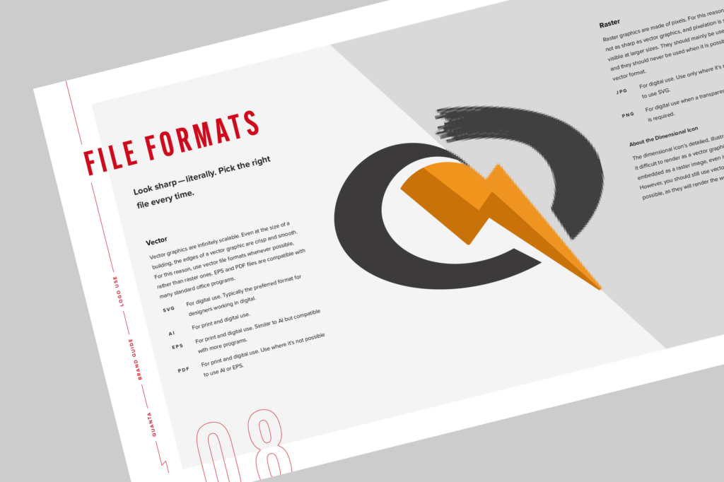
Logo folders usually contain dozens of files in several formats—SVG, AI, EPS, PDF, JPG, or PNG—which can intimidate non-designers. If they don’t understand what they’re for, a client may just reach for whatever’s familiar, even if it doesn’t produce the best result in their context.
Give them a rundown of the formats grouped by vector and raster file types. Under each format, describe whether it’s for print or digital use, and mention any distinctive features (for example, to use a PNG when a transparent background is required).
Encourage the use of vector images over raster ones by explaining the differences in plain language—that vector graphics are crisp at any size, while raster images are made of pixels, which can get blurry at larger sizes. Show a sharp version of the logo with the vector list and a pixellated one with the raster list to help convey the limitations of raster formats.
Include the overview in the brand guide alongside other logo use recommendations, or create a standalone, boilerplate PDF designed in your agency’s brand that you deliver with the final logo files for any brand project.
Recommend minimum sizes for both digital and print use.
Designers working primarily in digital mediums may forget to include the minimum size for print (and vice versa). But most logos will eventually appear in both digital and physical environments. Always provide both to protect the logo’s legibility no matter the context.
Give sub- and co-brands their own rules and guidance.
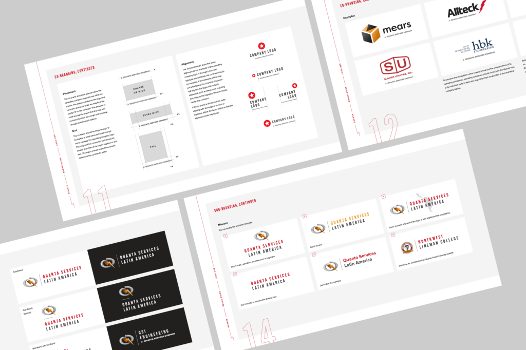
To help them look cohesive, subsidiaries or partners of an organization are often branded with a template that establishes the arrangement of logos, type, and graphics. Anticipate and illustrate likely misuses or abuses of the template—for example, changing type color or moving or removing an icon—as you would those of the organization’s primary logo. Offer examples of correct usage to help visualize the intended result. Create diagrams demonstrating how to place, align, and size co-brands relative to the partner logo. You can specify distance and size as you would clear space for a logo—for example, to place the co-brand below the partner logo at a distance equivalent to three times the height of the co-brand. Be sure to provide inverse templates for use on dark backgrounds, too.
Color
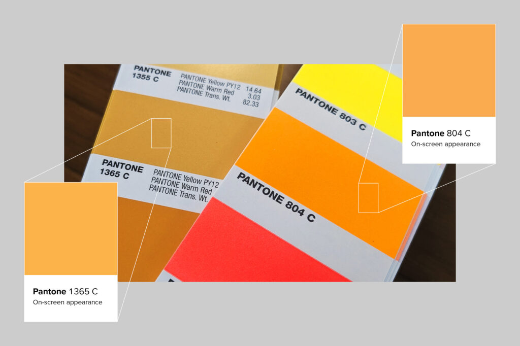
When selecting spot colors, don’t trust your screen—check an actual swatch book.
Adobe Illustrator’s “Recolor Artwork” feature is a convenient way to generate some possible spot color matches for your brand palette, and it’s tempting to drop them in your brand guide and call it a day. But RGB screen approximations of spot colors are just that: approximate. They can vary significantly in hue, value, or saturation from the actual spot color. Always look up your colors in a physical swatch book to ensure they’re a good match.
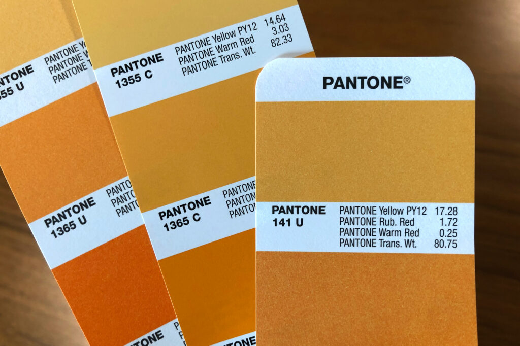
Don’t forget spot colors for uncoated media.
Because uncoated papers and substrates tend to absorb more ink than coated ones, ink printed on them can shift significantly in hue, value, and saturation, often becoming much lighter. Sometimes coated and uncoated spot colors look the same. But more likely than not, you’ll need to select a unique uncoated spot color to match the appearance of the coated one so that your clients have predictable and accurate results in print.
If non-designers will be using your brand guide, explain that coated and uncoated spot colors have been provided for consistency across print media, and recommend that they consult their print vendor to determine which is appropriate for their job.
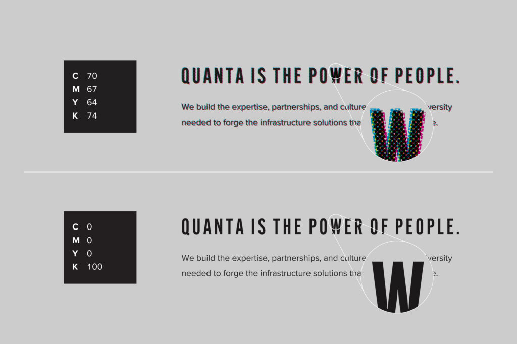
Choose “clean” CMYK builds using as few color channels as possible.
Have you ever flipped to a magazine page with blurry photos, or text with halos of color around it? Printing processes that use plates (like offset printing) can sometimes experience small shifts in registration that cause the cyan, magenta, yellow, and black color channels to misalign. The more channels a color employs, the more likely it is to blur if the plates misregister.
Design programs don’t optimize color builds when converting from RGB to CMYK—they may use up to all four channels. Examine each brand color and determine if it can built more simply without drastically changing the color. Is there a channel using only a small percentage of color? Can that channel be eliminated by increasing the percentage of other channels? Is it possible to make up the same color with two channels instead of four? Place the new and old colors directly next to each other in your design file so you can gauge how closely your changes replicate the original color.
Optimizing CMYK builds is particularly important for small or thin type knocked out of a dark background, where even slight shifts in registration can cause the letterforms to fill in and become illegible.
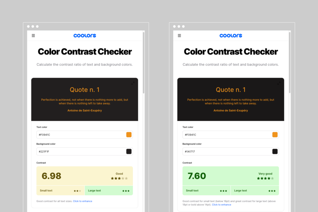
Plan for accessibility as you develop a brand color palette.
The Web Content Accessibility Guidelines (WCAG) are international standards that provide, among many other things, recommendations for color contrast so that people with low vision or color blindness can enjoy the same website functionality as a person with typical vision. Color contrast is critical for the legibility of text and the visibility of user interface components, such as buttons, icons, and form fields.
Many websites—such as Coolors or ColourContrast.cc—can help determine if your brand palette meets the WCAG standards by testing the contrast ratio of different color combinations. Adobe’s color tools analyze both contrast and accessibility for people with color blindness—they can simulate what your brand colors will look like for users with different vision abilities. Many color accessibility tools have also been adapted as browser or design program extensions, and some as apps for iOS or Android. They can help you revise your brand colors or offer alternates, tints, and shades to allow designers to meet contrast goals.
While the WCAG standards are intended for digital use, consideration of color accessibility is no less important in physical environments. Prioritizing contrast and legibility in wayfinding, product labeling, brochures, and other touch points provides a more inclusive, equitable experience of your brand for users with low vision or color blindness.
Typography
List acceptable weights and widths of each brand typeface.
Type families can be huge. Kepler, designed by Robert Slimbach, comprises a dizzying 168 fonts, with optical weights for caption, book, subheading, and display use, as well as condensed and extended widths. Some display typefaces include illustrative variants—with inline strokes or distressed textures—or visual effects that can be layered, like shadows or bevels. Superfamilies may offer serif, sans serif, flare serif, slab serif, mono, or rounded typefaces based on a similar construction. Variable and SVG fonts add to the chaos!
With so many potential options, it doesn’t cut it simply to provide the name of the type family. Even a slightly different font can look off-brand. Using medium instead of bold or a display weight instead of a book weight can create a dramatically different impression or even impair legibility. To prevent typographic mayhem, list the weights the brand uses (and the specific uses of each, if needed).
Get specific about type styling, such as case, tracking, and leading.
The same typeface can have entirely different effects based on its settings. With open, airy leading, a typeface might look luxurious and sophisticated, while tight leading can create a dense, emphatic text block. Titles in sentence case may seem casual or conversational, while title case adds formality.
These style choices aren’t right or wrong. But within a brand, they need to be consistent.
Designers often set the alphabet in the brand typefaces as a specimen to show what the standard characters look like. Unless the brand is very simple, the alphabet approach isn’t all that enlightening. Instead of, or in addition to, an alphabet specimen, provide a typographic hierarchy that shows the brand typefaces in use in body copy, emphasis text, and different levels of headings and subheadings. Next to each, indicate the leading (as a percentage of the font size), weight, case, and tracking. Don’t forget bulleted lists: You can specify the shape or character of the bullet, along with its color and size.
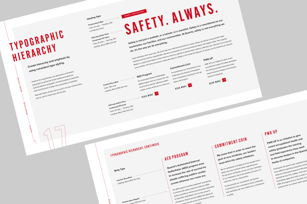
Brand guides can’t anticipate every individual implementation of a brand, nor should they: The best brand guides strike a balance between detail and simplicity to offer creators both structure and flexibility. But they should anticipate every major distribution channel so the many collaborators who work with a brand—creative agencies, in-house teams, developers, employees, printers, and others—can create successful work no matter the context.
“What I love about the culture at Carimus is that it thrives on a foundation of passion and excellence, where every individual is not just an employee but a valued contributor to our shared success story.
”
Looking beyond your own horizons?
Ready when
you are.
Blog & Posts
Thoughts, tips, and takeaways: what we’re looking at, learning about, and loving.




Designing Responsibly: Best Practices for ESG Content
Written By
Imagine that you’re a business searching for a sustainable supplier of job materials. Or an employee looking for a workplace where you’ll be valued and respected. Or a prospective investor seeking reassurance of a company’s responsibility. You’d be the prime audience for an organization’s ESG report.
What Is ESG Reporting, and Why Is It Important?
You’re probably already familiar with annual reports, which disclose financial information and summarize a company’s achievements for the year. An ESG report takes a similar form—and may be integrated into an annual report—but summarizes an organization’s environmental, social, and governance (ESG) impact.
Environmental factors may include ways that your company reduced carbon emissions, supported biodiversity, or diverted waste. Social issues may include your efforts to cultivate diversity, improve safety and workplace conditions, or volunteer in the communities where you work. Reporting on governance may include a profile of your corporate board and committees, descriptions of your policies and internal controls, and ways you engage shareholders.
While ESG reporting is still largely voluntary, it is increasingly important to shareholders of public companies, clients selecting who they work with, and customers choosing products and services. In 2020, 92% of companies in the S&P 500 published an ESG or sustainability report. In the eyes of investors, corporate responsibility and transparency correlates with lower risk, making ESG reports both useful to readers and strategic for your organization.
Function Before Form: Gathering Content
The most beautiful report in the world is only as good as its content. Before you involve designers, consider how you can make your content meaningful, consequential, and relevant:
- Define your target audience. Is it shareholders? Potential investors? Clients? Current employees? Prospective ones? It’s likely some mix of all of the above, but ranking your audiences can help you prioritize essential content. Don’t forget your competitors and industry partners. Especially if ESG reporting in your industry is in the nascent stages, you can pioneer the benchmarks for others and stand apart as a champion of corporate responsibility in your field.
- Establish a theme. Did your organization conquer an ESG challenge? Did you lead a major initiative that can set the tone? While some of your reporting will be general from year to year, a theme provides a narrative arc to make your report more engaging and focused.
- Start early. If you develop a theme, announce it to your employees so your teams can synchronize their content throughout the year. It takes some back-and-forth to get the necessary verbiage, media, and sources, so consider collecting ESG information from your departments or subsidiaries on a rolling or quarterly basis to avoid the rush.
- Catalog your achievements. Develop high-quality media to support your report. Hire professional photographers, videographers, and copywriters to document noteworthy projects, or engage a creative agency to do so for you.
- Crowd-source sustainability data. Carimus recently acquired JouleBug, an app that lets employers run challenges to encourage employees to improve their sustainability and wellness habits. The app tracks carbon emissions offset, water saved, and other metrics, allowing employees to contribute to an organization’s ESG goals.
- Adopt an ESG framework. Do you already use an ESG reporting software or dashboard? Can you connect your projects to the UN Sustainable Development Goals (SDGs)? Using a recognized framework (or two) can lend credibility to your reporting. Besides the SDGs, some common standards include the Global Reporting Initiative (GRI), Sustainability Accounting Standards Board (SASB), and Task Force on Climate-Related Financial Disclosures (TCFD).
- Make it count. Ensure that your statistics are above reproach and can be verified and substantiated. Audit your figures internally or externally. Don’t pad copy with purple prose, weasel words, or filler. If you don’t have enough content for a full-length report, introduce ESG reporting incrementally by adding a section to your annual report or creating a condensed or tearsheet version.

Structuring Content for Publication
Once you’ve gathered content, create features to pique interest and sustain deep reading.
Offer a Snack Before the Main Course
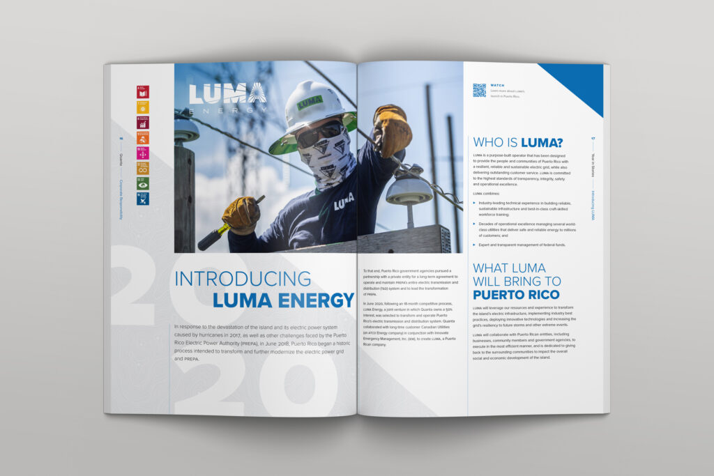
The beginning of a publication serves as an appetizer for the rest of the content. Think of your favorite magazine: before the long articles, it probably has sections with recurring columns, letters from the editor, and lots of highly-visual short features and teasers organized by topic. Your ESG report can use a similar format to hook readers and invest them in the longer-form content that follows.
Did your organization have a particularly news-worthy year? Consider a “Year-in-Review” with photos and short blurbs about major events, acquisitions, or accomplishments.
Did you surpass the ESG benchmarks you set in the previous year? Highlight your performance by making your data visual with graphs and charts, and include “Looking Ahead” sidebars to describe future goals and indicate your proactive commitment to raising the bar.
Or consider a deep survey of your initiatives for just one aspect of ESG.
If the rest of your ESG content is more dry, tabular, and quantitative, this is a chance to humanize your narrative and add color, figuratively and literally. More importantly, this is an opportunity to show readers that your commitments to responsibility are not just token or obligatory, but are crucial to your corporate identity.
Design for Different Reading Modes & Attention Spans
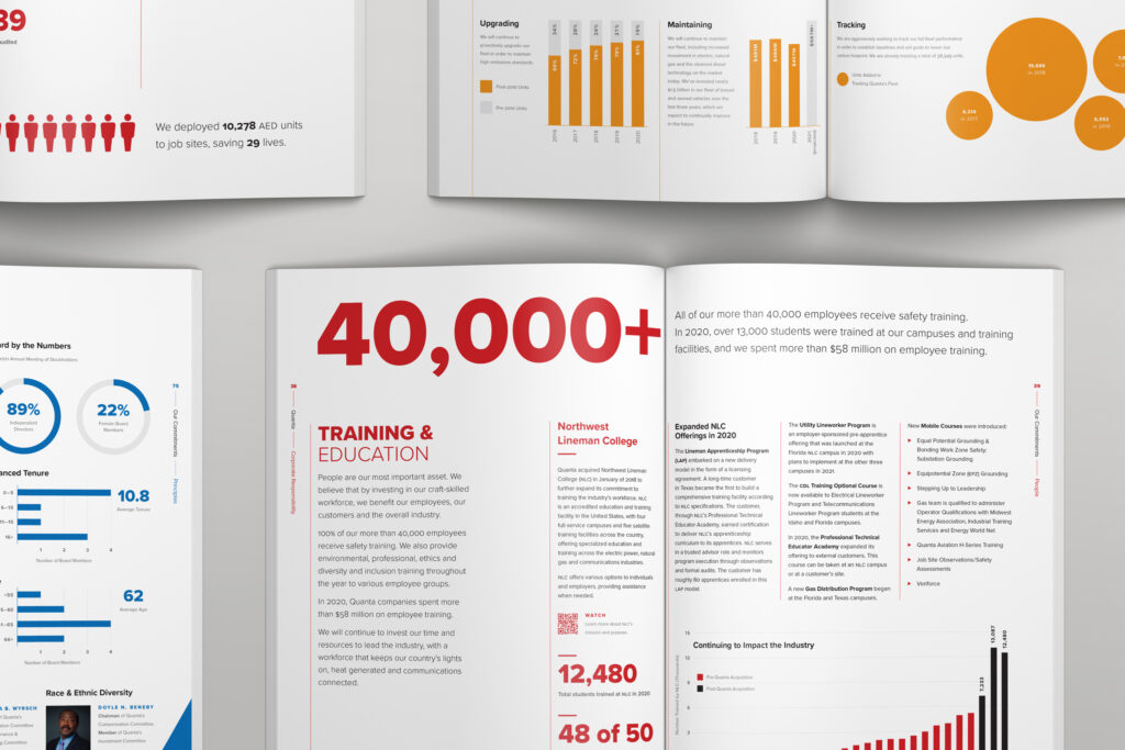
Make sure your content supports different types of browsing: the initial hook, light reading, and deep reading. Each of these types of content funnels the reader’s attention into the next level of reading. The hook is whatever instantly catches the eye: headlines, photos, and splashy graphics. This content must be intriguing and striking to persuade readers to dive into light reading, which includes decks (the short sentence under a headline that describes the article), sidebars, subheadings, captions, and smaller graphics. Deep reading is your long-form text.
In addition to encouraging readers to jump into deep reading, light reading lends variety to the page and breaks up blocks of text that might otherwise be fatiguing. Consider adding the following to your ESG report:
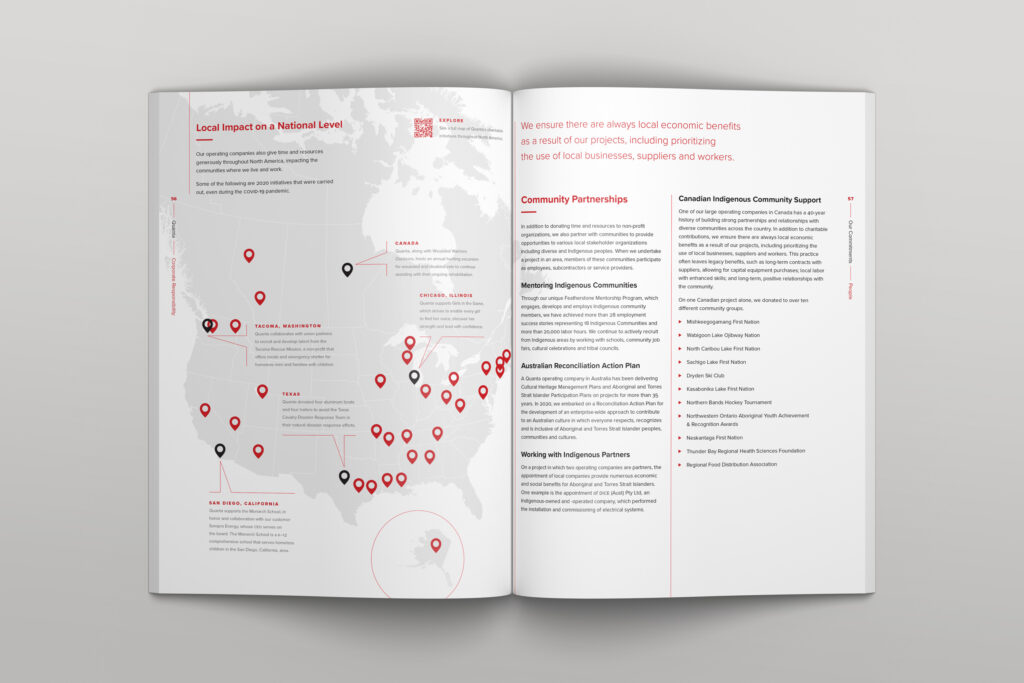
- Instead of using tables, visualize your data with infographics, such as bar, line, and pie charts; maps; diagrams; and timelines.
- Use by-the-numbers features to highlight important stand-alone statistics, like number of employees trained, tons of carbon offset, or total charitable donations.
- For slightly longer content, use callouts to showcase “fast facts” about your organization and ESG accomplishments.
- Sidebars are stories within stories. Use them to expand on noteworthy topics or ESG processes and policies that might otherwise get lost (or be distracting) in the main text.
- Use pull quotes to excerpt the most compelling quotes or important information in an article.
- Use digital features, like links or QR codes, to push readers to videos or more in-depth content on your website or ESG site.
In addition to guiding readers to deeper and deeper content, use transitional sections to control pacing and help readers navigate. For example, before text- or statistic-heavy descriptions of your ESG initiatives, add a photo-heavy spread with a section title and a short description of your reporting frameworks. Like the light-reading content listed above, transitions help break up long, potentially-fatiguing content.
By being mindful of your audience, developing meaningful data and media, and employing a wide variety of content types, you can create an ESG report that reads like a magazine instead of a spreadsheet.

Deliver to a Digital World
Take advantage of multiple digital channels to enhance your ESG narrative and increase exposure and engagement.
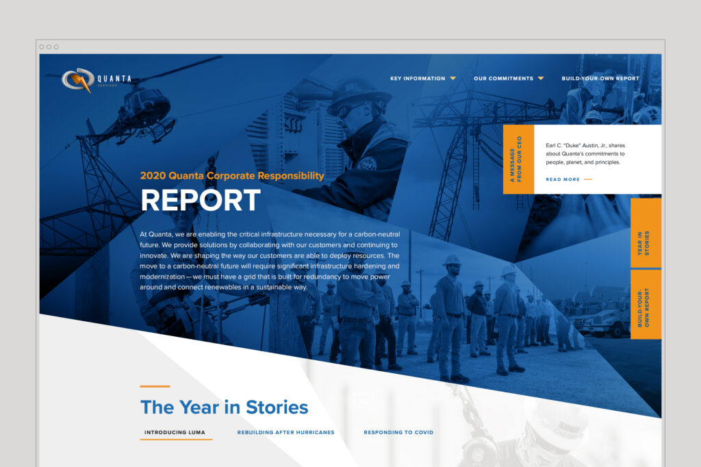
An ESG website deepens a reader’s understanding by allowing them to explore multimedia—interviews and testimonials, animations of technical processes, interactive infographics, and more—alongside text content. The web version can augment (or even stand in for) print, PDF, and e-book versions.
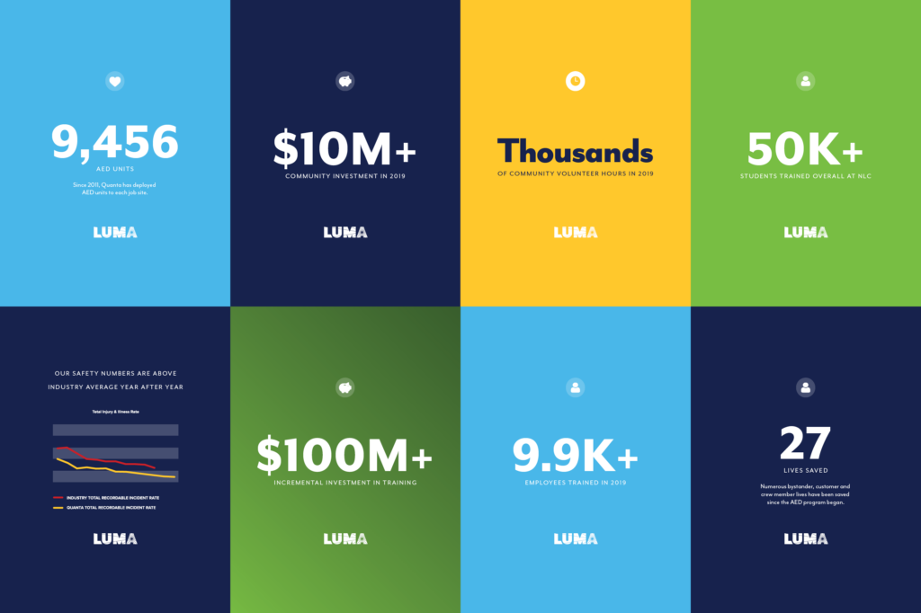
Harness social media to promote connection and community. Bite-sized content—pull quotes, photos, and animations—can entice your followers to read and share your ESG report. Get in front of the right audience with targeted ads and boosted content on social channels like Facebook or LinkedIn.
You’ve worked hard to make a real ESG impact, gather stories and metrics, and compile your efforts into a beautiful report. A thoughtful content marketing plan can maximize its reach and transform your ESG report from a once-a-year disclosure to a year-round priority.
Need help wrapping your hands around ESG communication at your company? We got you covered!
“What I love about the culture at Carimus is that it thrives on a foundation of passion and excellence, where every individual is not just an employee but a valued contributor to our shared success story.
”
Looking beyond your own horizons?
Ready when
you are.
Blog & Posts