
By Ariel Rudolph, Creative Lead
Every expression of your brand—from the most enduring campaign to the most fleeting social media post—is an opportunity to earn trust. Brand loyalty is built on trust, and trust is built on consistency.
Your brand should look and feel the same across every touchpoint, no matter where it appears or who’s implementing it. A brand guide aligns your employees, creative partners, and vendors to a shared vision and style so that everything they create reflects your values, boosts your recognition, and wins the confidence of your target audiences.
What is a brand guide?
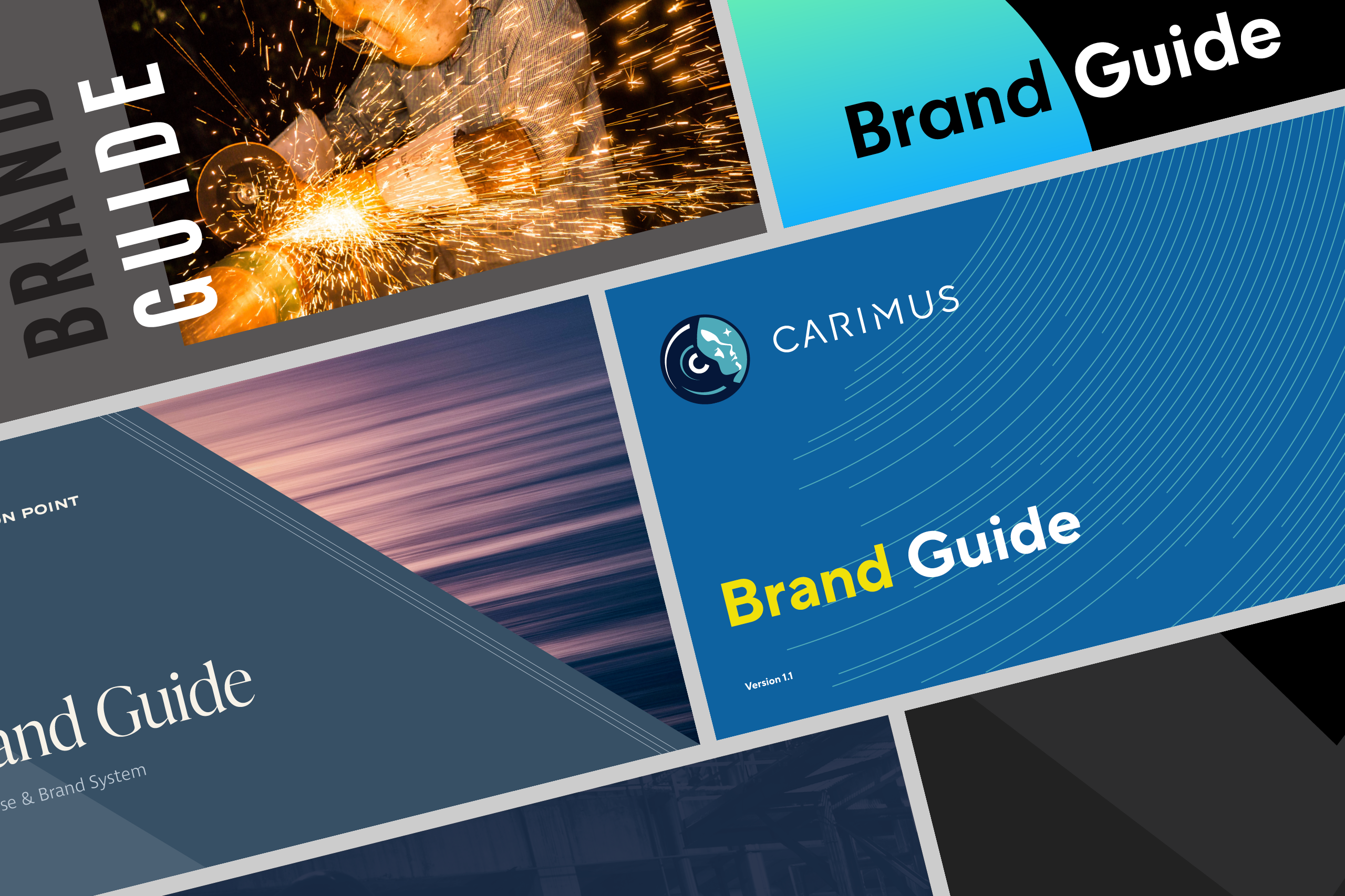
A brand guide is a document that defines and illustrates how an organization communicates with the world through its creative assets. A brand guide provides instructions for correct logo use, delineates a design system—including typography, colors, and more—and may give examples of the brand in use for context. It may also articulate messaging, such as an organization’s mission, values, or voice. Depending on the needs and scale of the organization, it may take the form of a PDF, a printed handout or booklet, or a website.
Why is a brand guide important?
You may have dozens, hundreds, or even thousands of people communicating on behalf of your organization. Employees represent your brand on a daily basis, as do business partners or subsidiaries. You collaborate with agencies or in-house teams for design, development, animation, photography, marketing, or other services. You work with printers or other vendors to produce promotional materials, merchandise, or signage.
A brand guide equips these many communicators with one definitive tool kit, allowing them to create materials that are consistent across every channel. By drawing on the same visual and verbal references, anyone can confidently apply the brand without resorting to guesswork, which ultimately saves time and money.
What makes a brand guide successful?
To be effective, a great brand guide is easy to use. It’s thoughtfully organized and includes an index or table of contents so readers can quickly navigate to relevant information. Its language is clear and crisp and avoids jargon—even a non-technical reader should be able to follow a guide’s essential brand standards. Likewise, its design and diagrams can be understood at a glance and are free of superfluous detail.
A great brand guide strikes a “Goldilocks” balance between specificity and flexibility, detail and simplicity. It addresses all of your brand’s common applications and use cases, but it’s concise enough to be easily browsed. And it should be instructive but not prescriptive. An overly permissive brand system is muddled and chaotic, and a rigid one is lifeless and sterile. The best ones provide both the structure and adaptability that creativity needs to thrive.

What to look for in a brand guide
A multinational company may need a book-length guide to account for its many markets, while a new business may need the brand equivalent of a quick start guide to get up and running fast. Or an organization may have both—employees who work closely with the brand need a deep dive, while others only need a one-page cheat sheet. There is no one-size-fits-all brand guide, but below are some standard features to consider:
Essential
- Logo: Gives an overview of the logo, including its color alternates and various lockups (layouts where its icon, text, and tagline are stacked or aligned in different arrangements or combinations). Recommends how much space to leave between the logo and other graphics to give it breathing room and suggests minimum dimensions for displaying the logo in digital and print environments so that it never becomes illegible. Often illustrates specific misuses so that the logo isn’t modified in an ugly or off-brand way.
- Color palette: Provides color swatches with values optimized for use in both digital (RGB and hex) and print (CMYK and Pantone) formats. You may need just a simple primary palette, or you may also need a secondary palette or tints and shades to add variety and flexibility. Color combinations on the web should have enough contrast for people with low vision to distinguish between text and background—some guides may provide alternate color values to improve legibility and meet web accessibility standards.
- Typography: Specifies which typefaces and weights (different thicknesses such as light, book, or bold) to use. Often presents a specimen, such as an alphabet or a short passage, to demonstrate the typefaces in use and provide context.
Intermediate
- Typographic hierarchy: Builds on the basic type specimen with more specific styling for headings, subheadings, body copy, bulleted lists, and other text, as well as detailed recommendations about color, capitalization, tracking (the distance between letters), and leading (the space between lines).
- Photography: Makes recommendations for lighting, composition, mood, perspective, and subject matter and shares example images. May also suggest color or lighting effects and techniques to make photos feel unique to the brand.
- Design elements: Offers a set of patterns, shapes, textures, or other treatments to add depth and interest to layouts.
- Brand in action: Shares examples of the brand in use for reference, such as stationery or mockups that were developed during the branding or rebranding process.
- Basic messaging: Defines the personality and voice in which you write.

Comprehensive
- Sub- and co-branding: Establishes a system for branding internal departments, organizations, or business units (sub-branding) and subsidiaries or business partnerships (co-branding).
- Special logo treatments: Offers customized versions of the logo for challenging contexts—such as tiny logos for responsive designs or favicons—or unique treatments, such as app icons or social avatars.
- Illustration: Shows how color, lines, shapes, and textures can be used to build images.
- Iconography: Describes how to draw simple pictographs to use as navigational or decorative elements.
- Layout: Demonstrates how to arrange and scale text, graphics, and images using specific margins, grids, alignment, layering, and cropping.
- Motion graphics: Features methods and technical advice for animating design elements and working with video.
- Brand strategy: Establishes the goals of the company and brand with mission, values, positioning statements, and approaches for relating to your audiences through design and content.
- In-depth messaging: May include a tagline, value propositions, tone recommendations for each of your target audiences, and boilerplate language (snippets of text to use in different contexts and channels).
- Custom guidelines: Documents applications that are specific to your organization’s particular needs, such as vehicle livery, employee uniforms, signage, social media designs, or unique templates.
As your organization evolves, so should your brand guide. Just as you periodically assess your business strategy, you should also routinely take stock of your brand to determine what new direction your team needs to produce consistent communications.
A brand is much more than a logo—it’s a dynamic set of visual and verbal tools. Whether it’s a single page or a comprehensive book or website, a brand guide gives your entire organization and its partners a single reference for using those tools to create memorable, striking work that wins the trust of your audience.
