Insights
Designing for the Age of Insight: Reflections from UXPALOOZA 2025
December 9, 2025
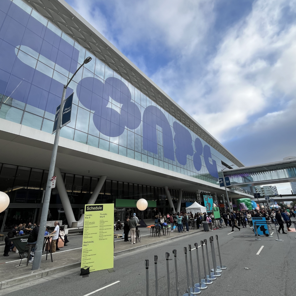
Exploring AI and the Future of Design In September, UXPALOOZA 2025 brought together designers, researchers, and product thinkers to explore how artificial intelligence is reshaping human experience and the future of design. The virtual…
By Category
November 10, 2025
Carimus + Spyrosoft Group: Expanded capabilities. Global reach. Endless possibilities.
Business

April 15, 2025
Streamlining M&A Digital Transformation: A Scalable Solution for Energy Conglomerates
Business

July 23, 2024
Crafting an Excellent Experience: Part Two – Project Execution
Business
Creative
Design