Innovation Insight: Accessible Perceptual Contrast Algorithm
Written By
At Carimus, we value curiosity and connection. We surround ourselves with team members who love to learn and stay knowledgeable about the latest advances in their field.

One of our Graphic Designers, Kaitlyn Wellborn, recently discovered the benefits of using the Accessible Perceptual Contrast Algorithm (APCA) when creating accessible user experiences. Read this article to understand how this innovation affects you and your website design capabilities.
What is APCA?
The Accessible Perceptual Contrast Algorithm (APCA) is a method grounded in scientific research. It is designed to accommodate the nuances of vision by considering how the brain interprets varying colors and luminance levels. APCA and the APC Readability Criterion are based on human perception, including that of people with impairments. Built around light contrast 15 (Lc 15), the APCA Contrast Calculator also evaluates font size.
What is “luminance,” and why does it matter?
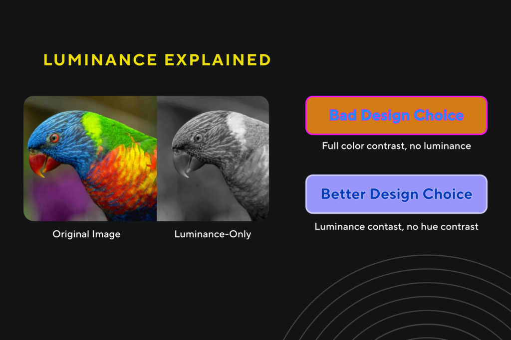
Luminance is the first thing our brain’s visual cortex processes and is what allows us to see shape and detail. Luminance contrast is the light reflected off one surface or component compared to the light reflected off another surface or component.
When designing graphics, a symbol’s legibility and salience are strongly influenced by the relationship between its luminance and the luminance of its immediate background rather than its own absolute luminance.
Why is APCA important?
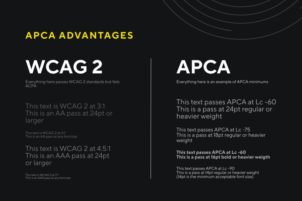
Though it hasn’t been officially announced yet, APCA is likely to be included in WCAG 3. The current luminance contrast ratios for WCAG are not uniform to perception, whereas APCA calculates contrast differently, making it more accessible. The WCAG 2.2 contrast is very restrictive, only working when the background is very light with significantly darker text, and doesn’t work in reverse situations or dark mode, unlike APCA.
During the development of APCA, its creator, Andrew Somers, encountered research from Cambridge that revealed a surprising finding: 47% of the colors deemed acceptable by WCAG 2 were actually unreadable. Paradoxically, approximately 23% of the colors rejected by WCAG 2 were found to be legible and even more so for individuals with color vision deficiencies.
What is WCAG?
WCAG stands for “Web Content Accessibility Guidelines.” Published by the World Wide Web Consortium, WCAG is the international standard for web accessibility, which aligns with ADA compliance. Currently, version 2.2 is predominantly utilized, with WCAG 3.0 in beta.
Why is WCAG important?
The “Web Content Accessibility Guidelines” are crucial for inclusivity, user experience, market reach, and corporate responsibility. WCAG promotes the diversity of accessible audiences without the barriers of impairments, languages, device compatibility issues, or even age discrimination. By making digital content accessible, organizations can reach a broader audience. Embracing accessibility demonstrates corporate social responsibility and commitment to diversity and inclusion.
Accessibility benefits everyone, not just users with disabilities. Straightforward navigation and well-structured and adaptable design improve the overall user experience. WCAG is the framework for ensuring that the internet is accessible to everyone, regardless of their abilities, which is essential for a fair and equitable online experience.
In Conclusion
When correctly using APCA readability criteria, you will create a much more accessible result that everyone has a better time reading. Kaitlyn also found a Figma plugin that supports APCA. When utilizing this tool, designers will experience increased productivity, flexibility, and efficiency. By staying current with innovations like APCA, you will be ADA-compliant, reach a larger audience, and stay ahead of the ever-changing curve.
“What I love about the culture at Carimus is that it thrives on a foundation of passion and excellence, where every individual is not just an employee but a valued contributor to our shared success story.
”
Looking beyond your own horizons?
Ready when
you are.
Sources
- https://git.apcacontrast.com/documentation/APCAeasyIntro.html
- https://www.myndex.com/APCA
- https://www.w3.org/WAI/standards-guidelines/wcag
- https://www.figma.com/community/plugin/748533339900865323
- https://medium.com/@colleengratzer/how-apca-changes-accessible-contrast-with-andrew-somers-3d47627a5e16
- https://www.readtech.org/ARC
- https://colorusage.arc.nasa.gov/luminance_cont.php
- https://lumilab.com.au/about/what-is-luminance-contrast/#:~:text=Definition,from%20another%20surface%20or%20component
Blog & News